““ How might we create an accessible mobile experience to help data storage administrators and managers quickly monitor and locate problems on the go? “”
Problem
Dell just launched a new data management and insights desktop software - DataIQ, to empower organizations to identify, classify, and monitor data between the storage system and the cloud. However, users are unable to monitor data and receive alerts when they are away from the desktop. We partnered with Dell to provide an accessible mobile dashboard experience, to help storage administrators and storage managers to receive alerts, acknowledge ticket, and monitor data whenever and wherever.
My role
UX designer
UX researcher
Who I worked with
Dell stakeholders:
UX Designer
UX Researcher
Engineers
Storage adminitrator
Storage manager
Teammates: 3 HCDE cohorts
Tools I used
Figma
Whimsical
Principle
Concept video
This is our concept video pitching the final solution. The detailed design process is followed.
Design Process
Persona
The project focused on two users: data storage administrator (primary) and data storage manager (secondary), who monitor and manage Dell EMC Isilon system for their enterprises.
Data storage administrator
Be alerted with critical events or performance issues.
Locate problems and monitor cluster status.
Acknowledge the issues and follow up with ticket status.
Data storage manager
Proactively monitor cluster health status and performance.
Monitor cluster capacity & usage to inform business decisions.
Delegate personnel to follow up issues not being resolved.
Discovery phases
To understand what the current desktop experience is and users’ pain points, we did 7 SME interviews and 2 user interviews. Based on the research result, we proposed a new mobile experience to address those pain points.
Main pain points:
Storage administrators need to navigate multiple third-party apps to complete their workflow from receiving alerts, identifying issues, ticket-tracking to troubleshooting.
No direct way to monitor clusters and issues on the go.
Storage administrators are unable to cater alert threshold or metrics to their monitoring needs.
Storage administrators would like a simple mobile app that prioritizes alerts and key information to locate issues.
Scenarios
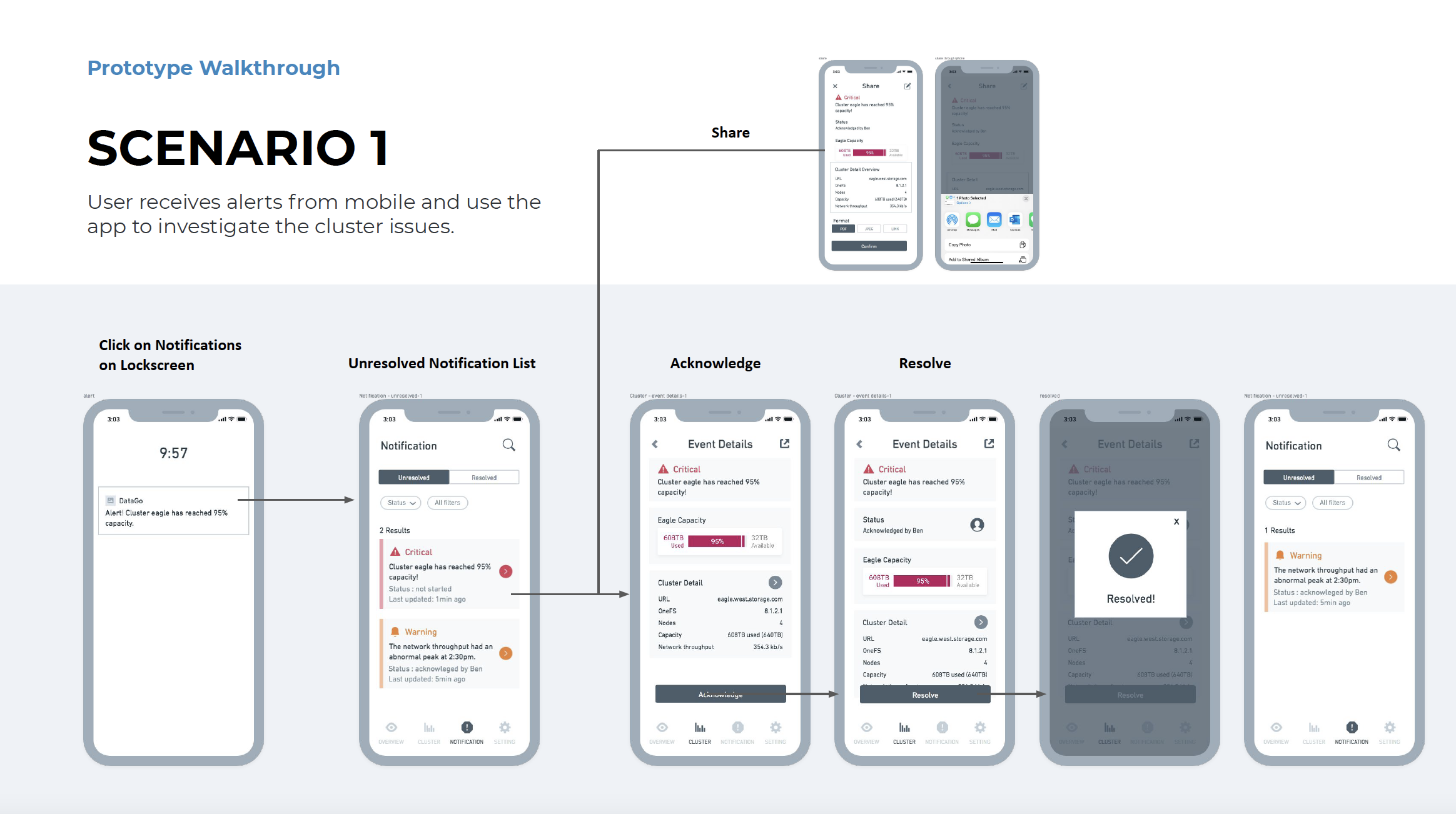
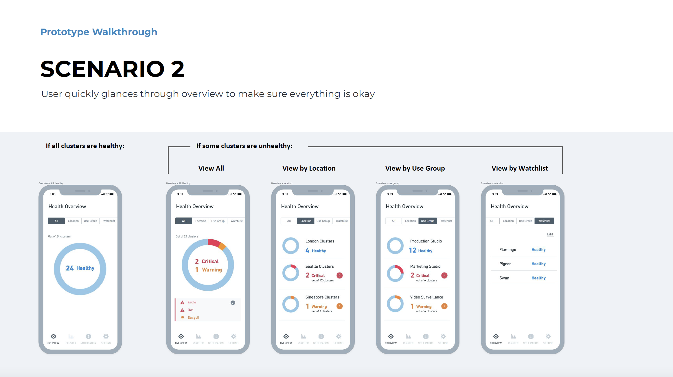
Based on our research result by interviewing subject matter experts, we established two key scenarios of how storage administrators will use the DataGo app.
1. Stay alerted and act quickly
2. Proactively monitoring
Ideation
Wireframe
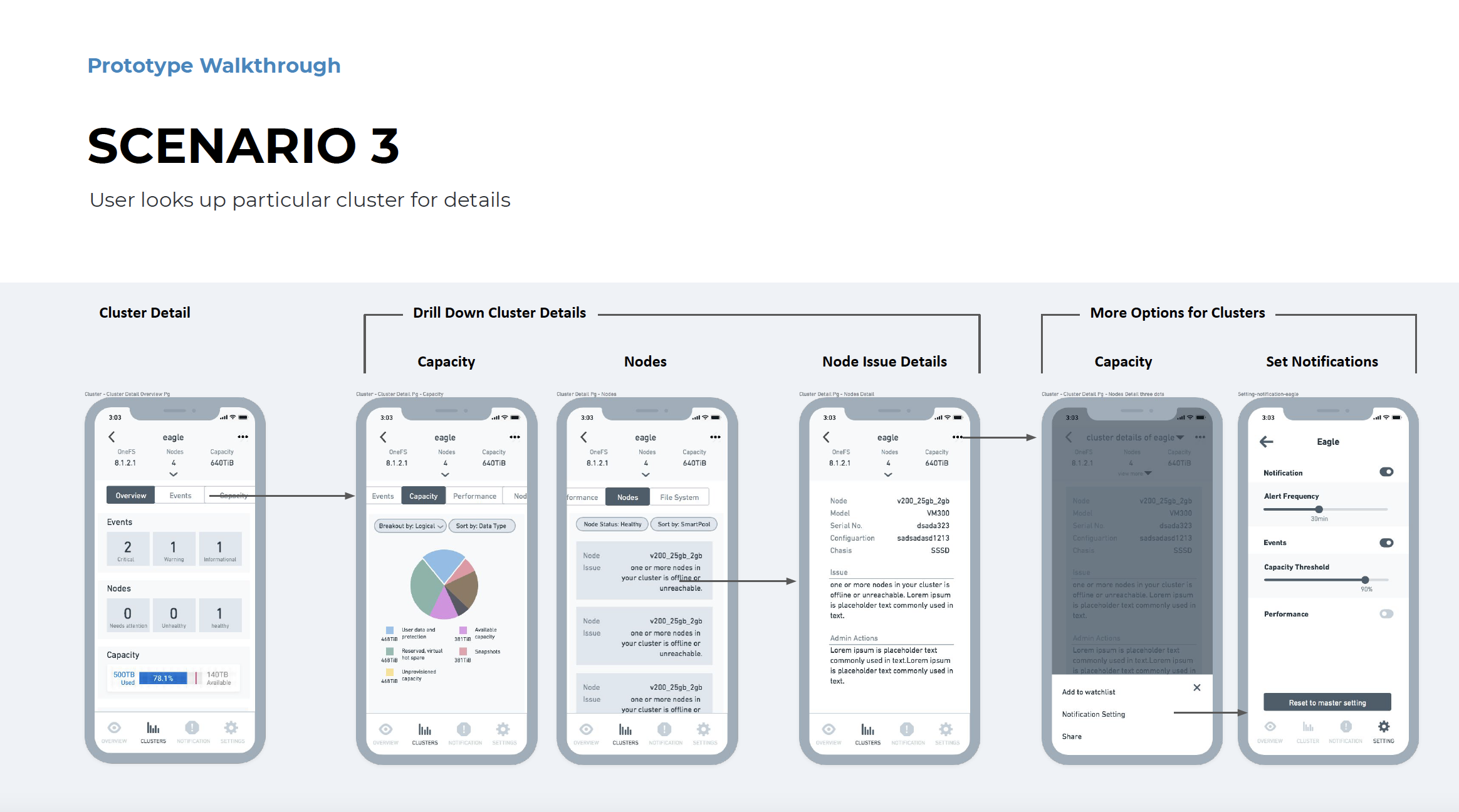
Based on the senarios and user flow, we developed the initial wireframe, and determined four main features in the DataGo app.
Usability Testing & Major Iterations
We did 3 rounds of usability testings in total, each with wireframe, low-fi prototype, and high-fi prototype. Each round had at least 3 participants. Here are some major research findings and iterations after rounds of usability testing.
1. Overview: navigation is not intuitive and accessibility issue.
Users wanted to navigate independently to problematic cluster details.
Warning and critical color have an accessibility issue.
Iterations: Separate alerts from different clusters. Navigate users directly to specific cluster details instead of the notification page. Evaluate accessibility carefully when choosing the color palette.
2. Clusters: Status filter is the most important.
Status filter is the most important.
Other filters are either non-necessary or challenging in backend
Iterations: Put status filters upfront.
3. Notification: Group notifications to reduce repetitive info.
Too many notifications will overwhelm users.
Users would like to check all tickets from the team.
Iterations: From Notification-based to Ticket-based Alerts to group notifications generated by the same event/ticket; Ticket based alerts always display the latest status; Put resolved tickets in “history”; Separate “my tickets” and “all tickets” to give users a holistic view of the ticket system.
4. Setting: More granularity in customizing settings.
Users would like to have more precision control to customize settings.
Users were confused about the master setting.
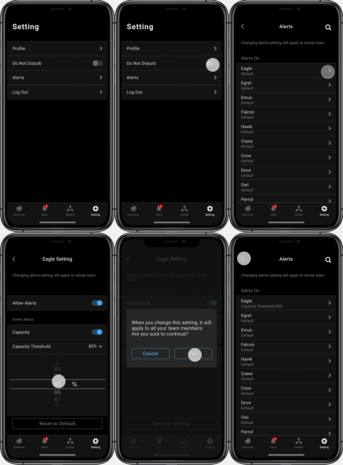
Alerts threshold should be team-wide decisions.
Iterations: Use number spinner control instead of slide bar; Remove “master setting” and add “reset to default” in an individual setting; The Customized setting will be applied to the whole team to keep members accountable to the same standard.
Visual Design
1. Accessible color palette
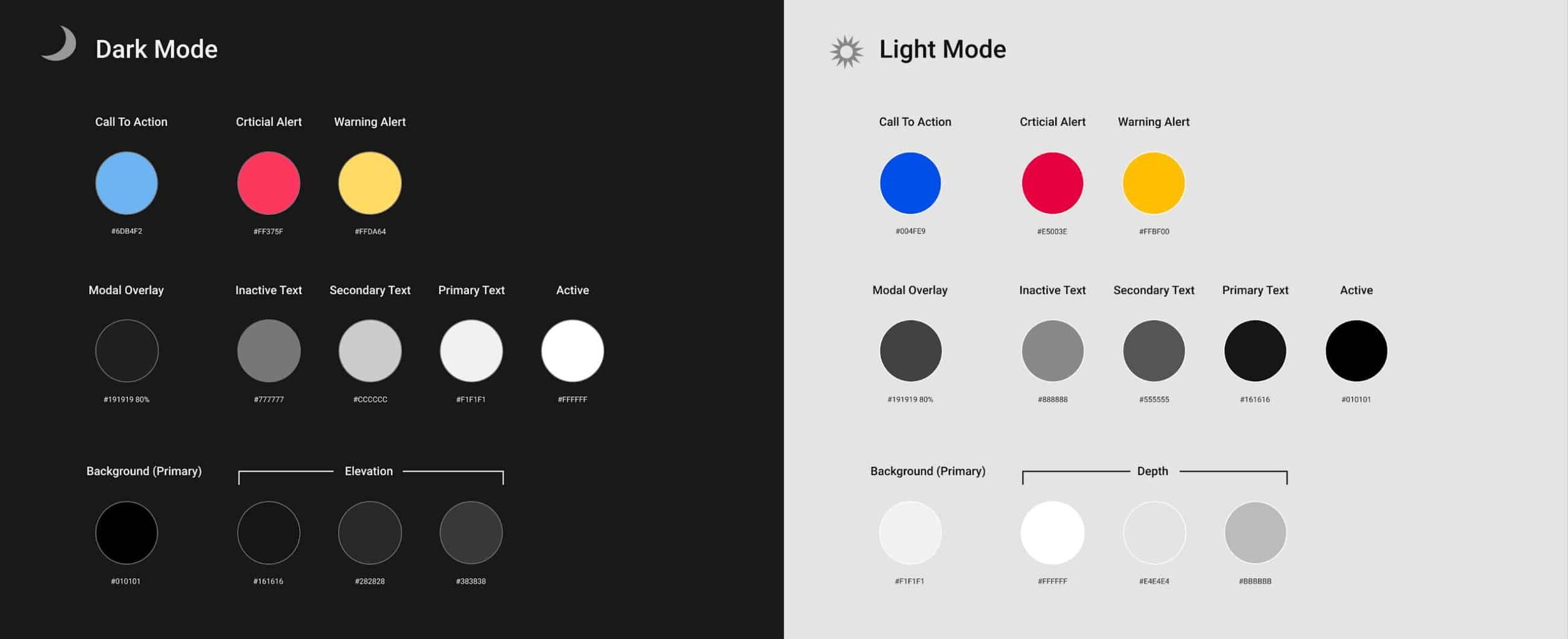
We developed both light and dark mode to embrace various users’ preferences relative to their environment and eye strain tolerance. Colors are strategically picked to call attention to alerts, while a spectrum of grey is used to create elevation. Each color is carefully assessed against its background to make sure it is accessible.
2. Design System
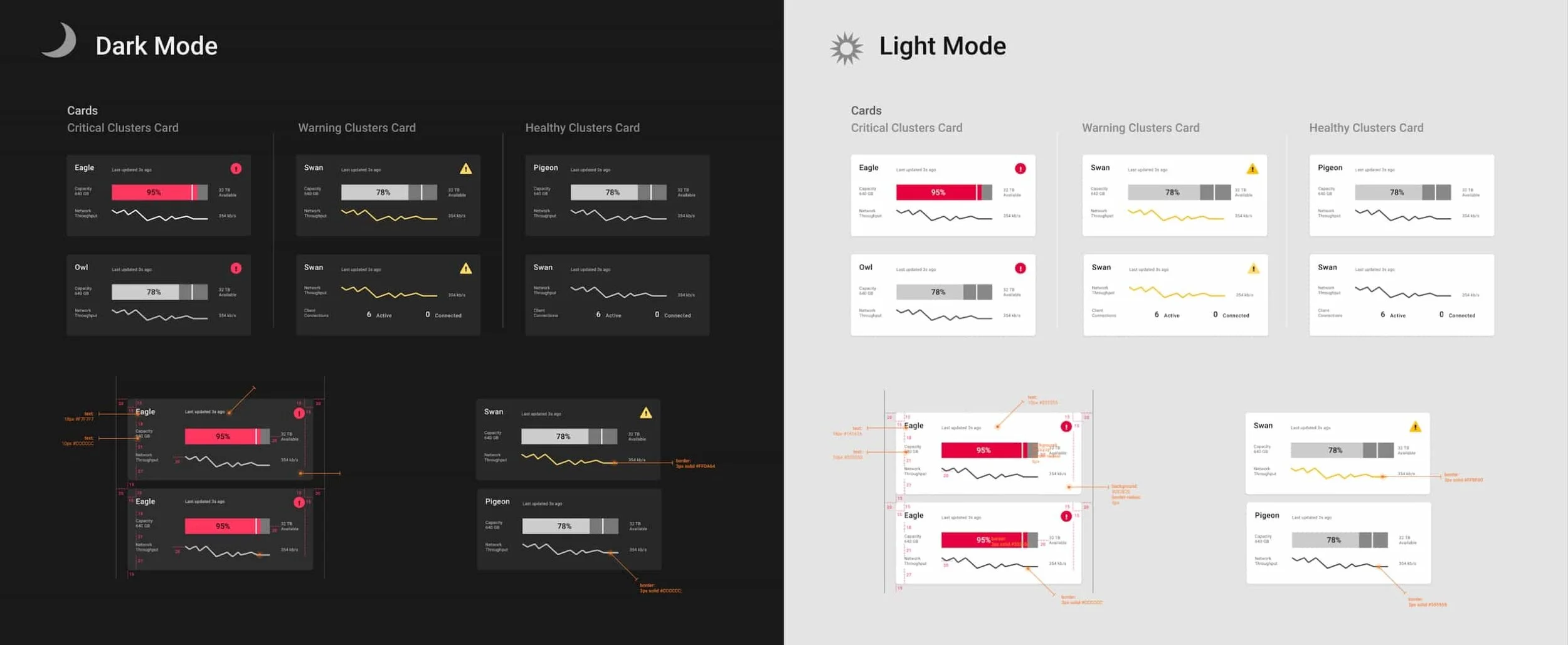
One of the challenge we had is to build a unique design system to optimize the experience in data viz and information comprehension in DataGo. After rounds of iterations, we built the brand-new atomic design system includes typography, color palette, icon, filter, button, tab, card, list, and visualization. Below is an example of cards with specification.
3. Visual mockups
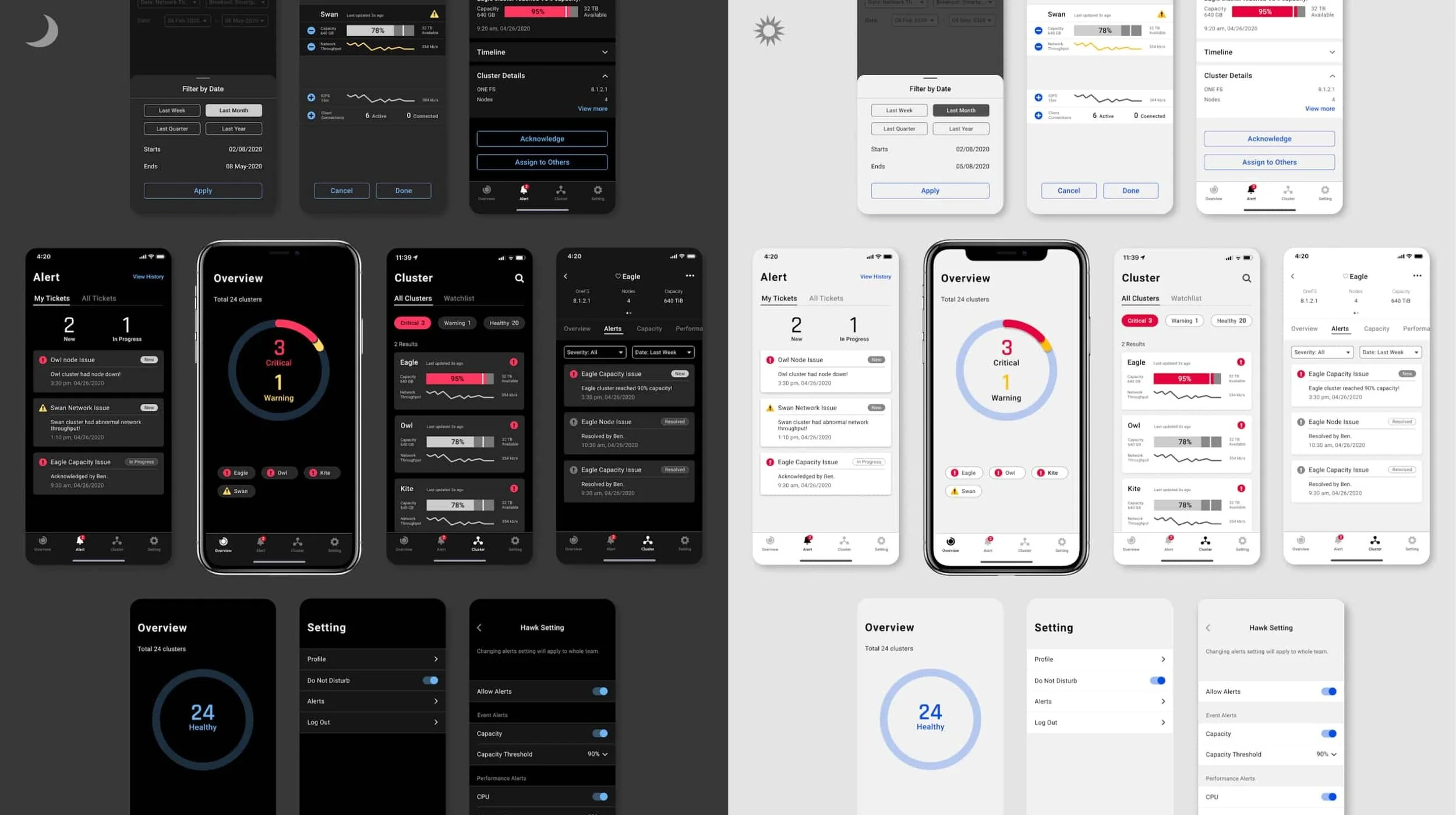
We delivered end-to-end experience in both light and dark mode.
Hi-fi Deliverables
Onboarding
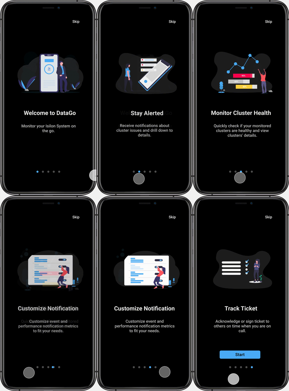
The onboarding experience provides first-time users top benefits of the app, highlighting the features and setting users up for continued success.
Receive alerts and act quickly
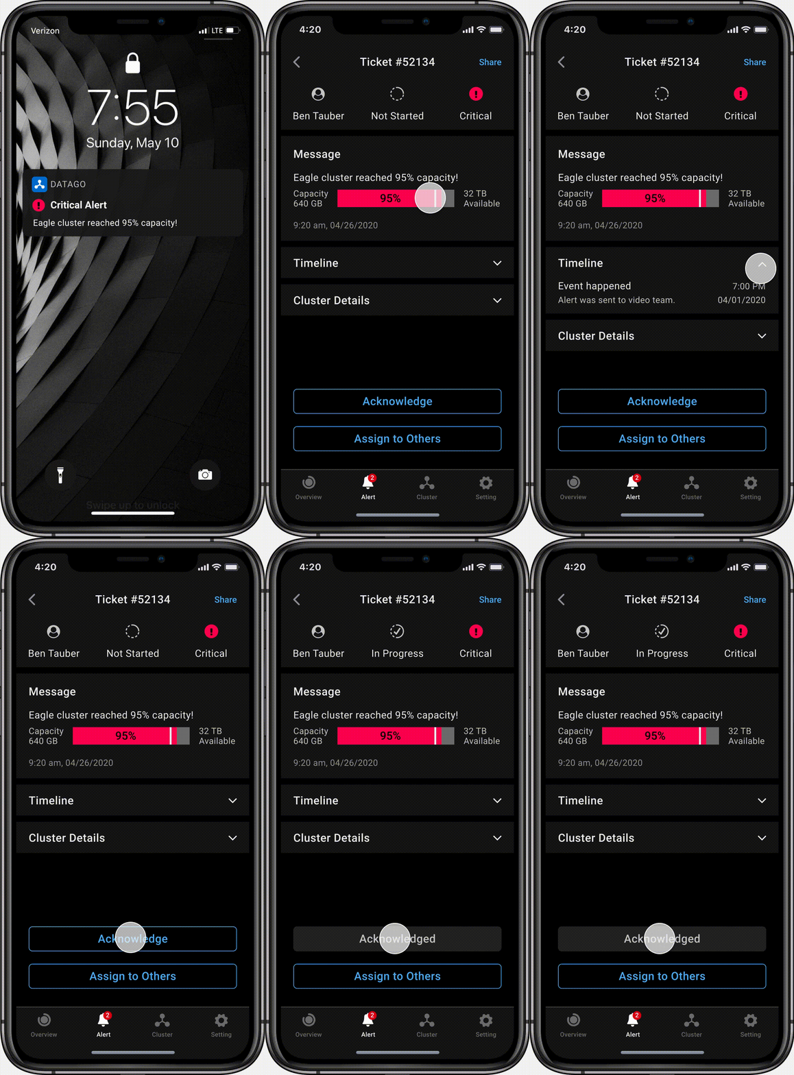
When received alerts, users can tap to view ticket summary and take actions to ack or reassign the ticket. When ticket is resolved, users will receive a notification for the update.
Overview of health
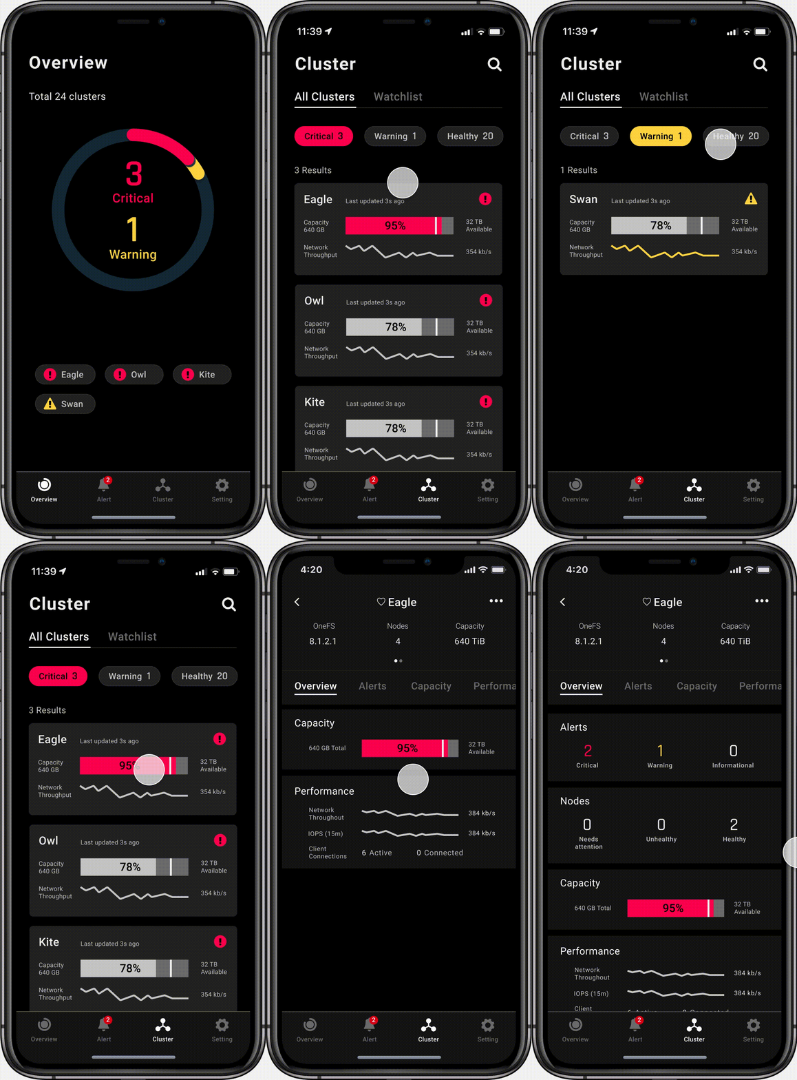
Users can have a quick overview of all clusters’ health status, and dive deep into the clusters which have critical issues.
View tickets
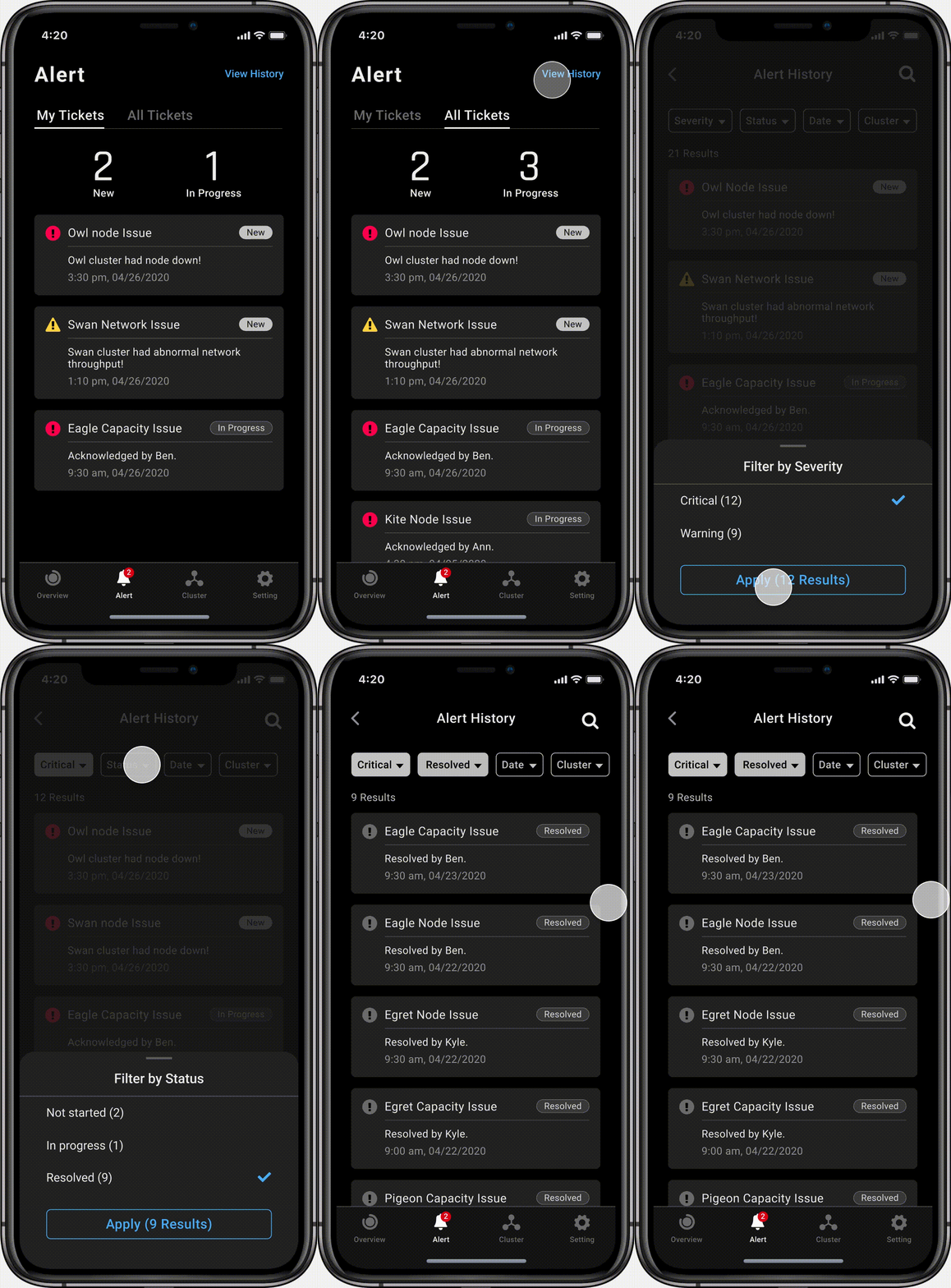
Users can view their own tickets and all the team’s tickets about clusters. They can keep track of the tickets and have an estimate of their workload.
Customize watchlist
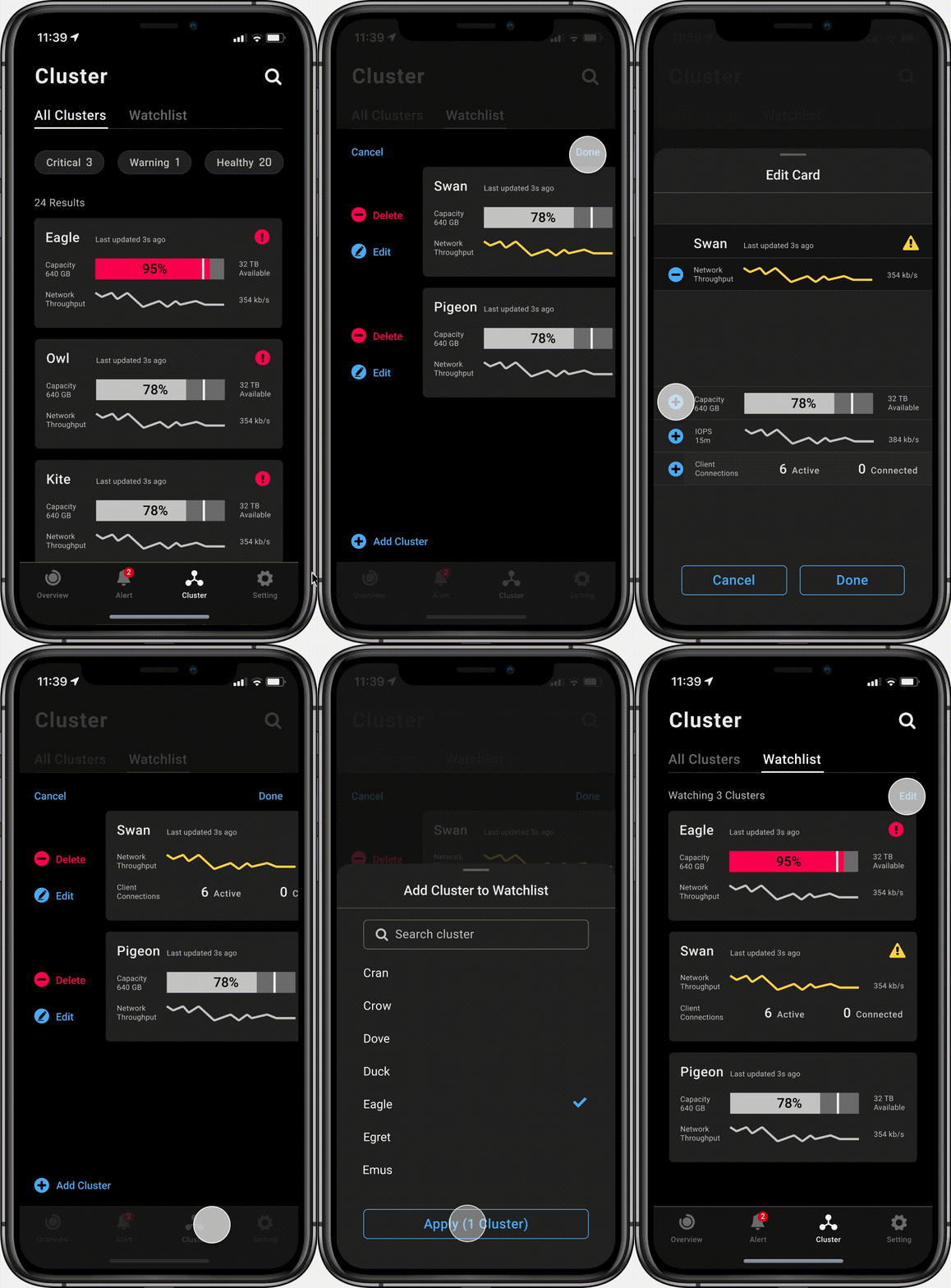
For scalability when enterprise has a lot of clusters , user can mark cluster of interest to watchlist for faster access of information on small screen.
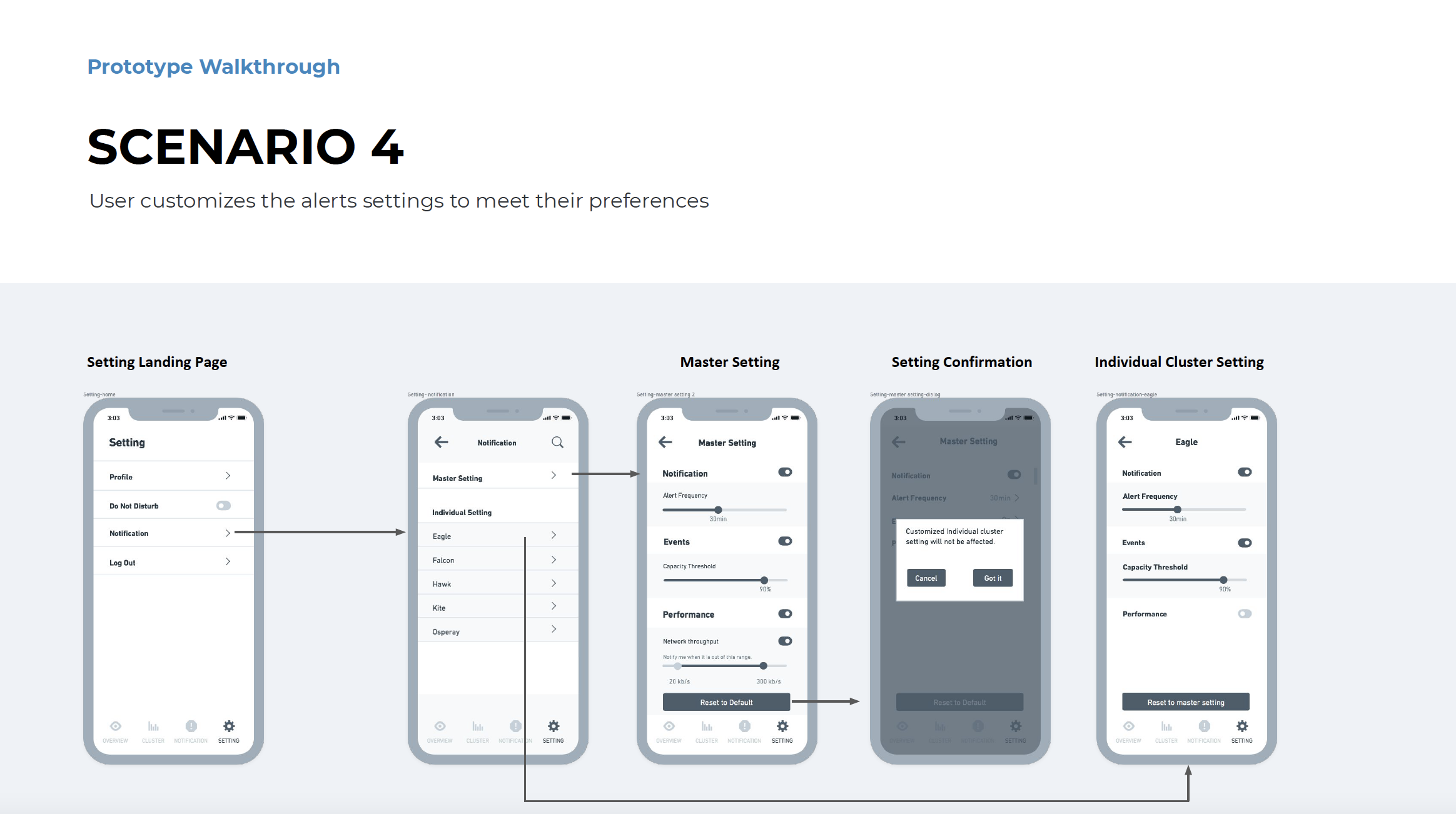
Customize alert thresholds
For proactively monitoring the clusters, users can customize to receive alerts for specific metrics and adjust the threshold to fit the users’ needs.
Evaluation
In the last round of usability testing, we tested with 3 users and asked them to finish the SUS survey to evaluate the app after they explored it. The result indicates usability scores of A compared to industry standards.
“Very good! I think it is very intuitive and will be very helpful to my work!”
“When will that be available?”
“It helps [me] simplify my routine work!”
Reflection
1. Discover new insights and iterate along the way
We started with designing for a sole user in mind. With rounds of usability testing, we realized that we should consider how administrators work as a team to communicate and collaborate when things go beyond one person’s capability.
2. Dive in the technical knowledge before design
This project is one of the projects that technical knowledge could greatly influence the design decision. We believe it will be very beneficial to spend more time understanding how things actually work in the beginning and prevent unfeasible design solutions.
3. Use show-and-tell to communicate effectively
During group work and peer critique sessions, we learned instead of spending a long time explaining ideas by word, it is more effective to demonstrate ideas through quick sketches. When drawing starts, confusion ends.


