“How do we design a seamless experience to let people make appointments with doctors online? ”
Problem
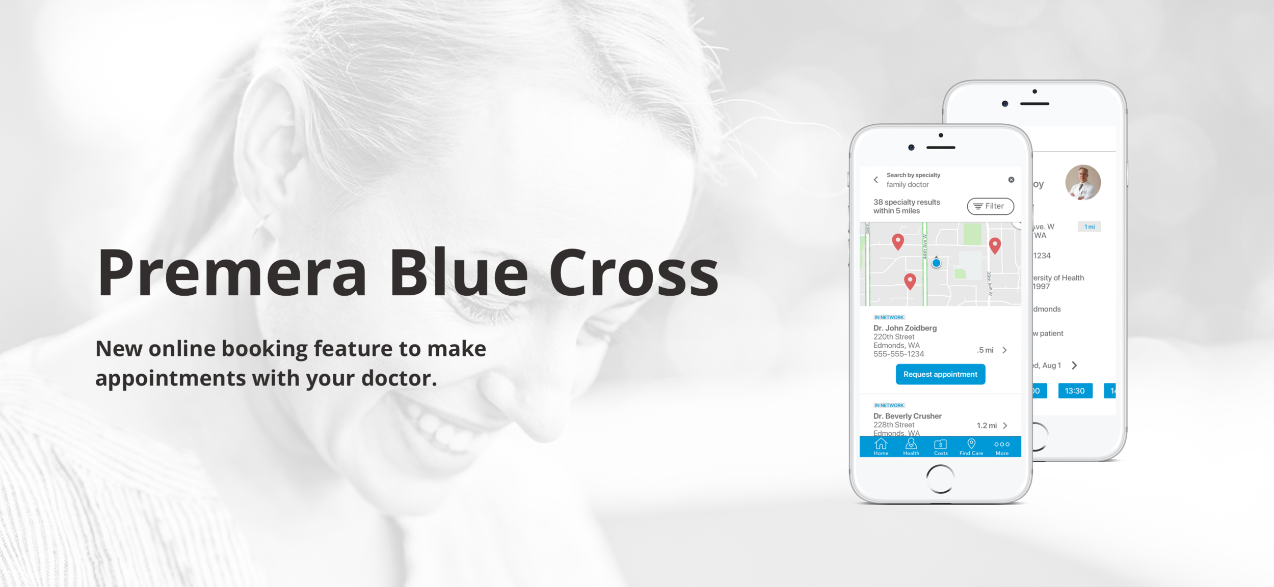
Premera Blue Cross provides health care service to Alaska and Washington. The company wants to develop an online booking feature, allowing members to make medical appointments online with doctors via Premera Mobile App.
There are two business objectives:
Enhance customer experience and CX score by facilitating the booking doctor appointment process;
Increase patients' flow to high-value doctors.
My role
UX designer
UX researcher
Who I worked with
UX Designer
UX Researcher
Content Strategist
Dev Team
Project Manager
Tools I used
Sketch
Figma
InVision
Principle
UserTesting
SurveyMonkey
Discovery phases
I did 250 surveys and 8 user interviews to understand “why” and “how” would people make online medical appointment. The research revealed insights into:
People’s opinion and expectation of online medical booking tool.
What ‘s their motivation to use online booking tool.
What information do people need to decide to book with a certain doctor.
What post-booking experience is expected.
Main findings:
90% of people would love to use the online booking feature through health insurance company.
100% of people have more positive feeling towards doctors who offer ability to book online.
55% of people use the online booking feature to book for new doctors, so the feature should exist under “find care” tab.
Minimum information users need to decide the doctor: in-network (83%), specialty (81%), reviews (77%), distance (71%), name (63%), and years of practicing (63%).
90% of people expect to be able to book for dependents. If not, users would like to be informed as early as possible.
Post-booking experience: 75% of people prefer to receive confirmation email; 70% of people prefer to receive reminders via text, but most of users would add to the calendar themselves.
No confirmation after booking would result in a bad experience. (Our Technical Constraints)
Low- Fi design & Rationale
Based the user research, I did explorative design on the online booking flow and integrated the research findings in the design.
Wireframe
High-fi prototype
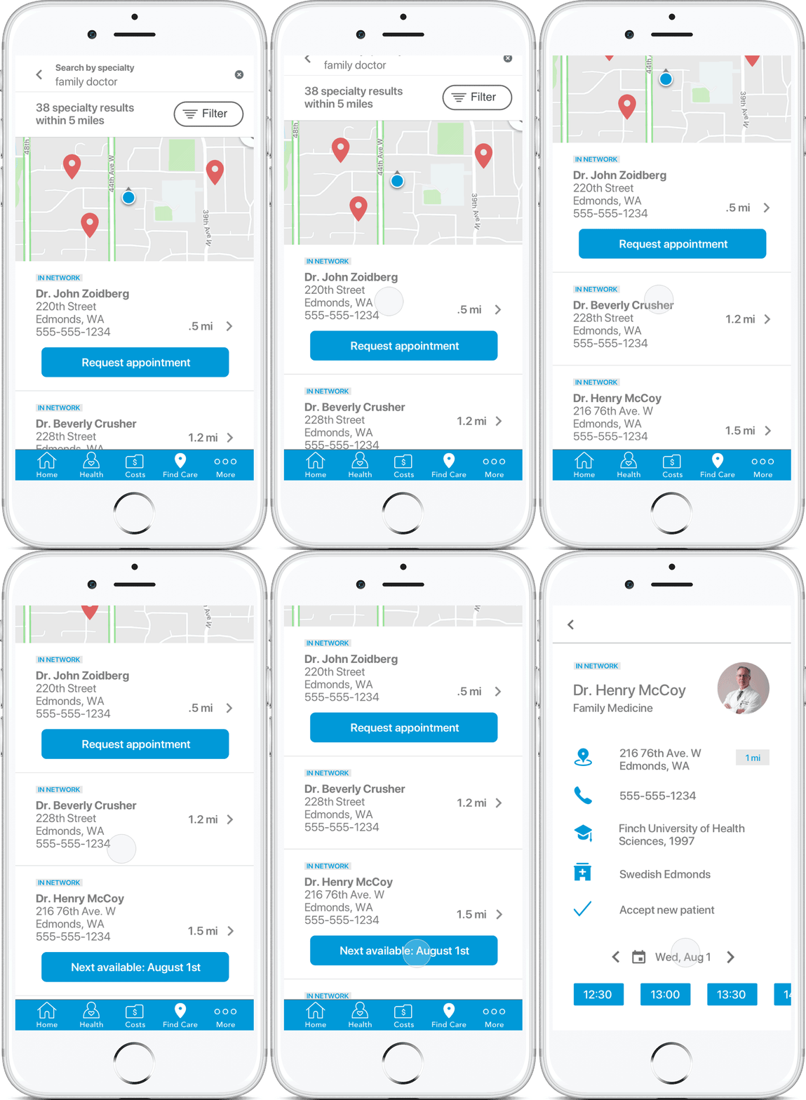
Search doctor
We made a hypothesis that showing availability of doctors in the search page can drive people to initiate the booking feature, which proved to be true in the later usability testing.
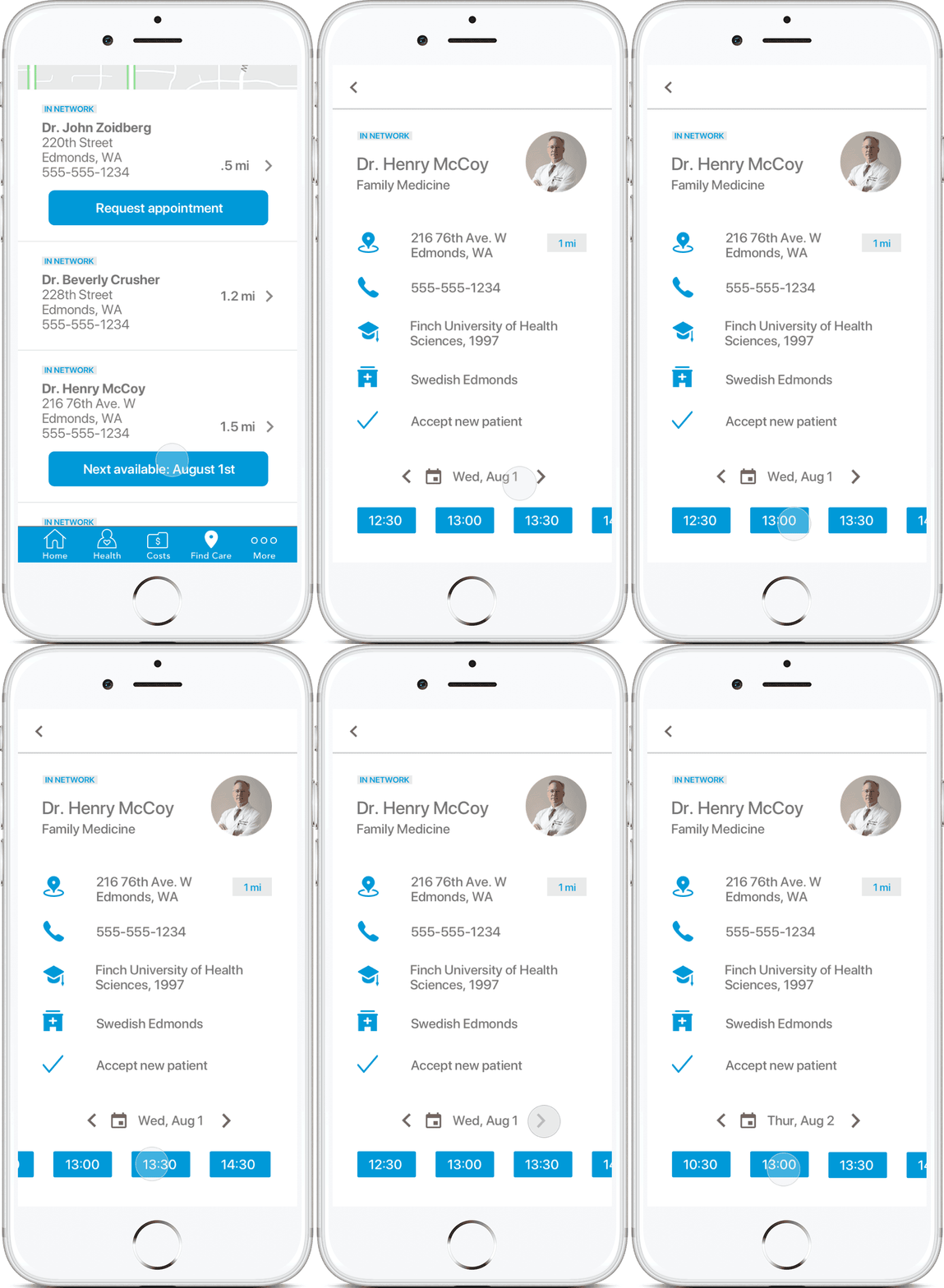
Check availability
In the doctor detail page, we show the most relevant information that users care about to make decision. Using scrollable tabs to explore and check doctor’s availability is intuitive and friendly to users.
Booking model
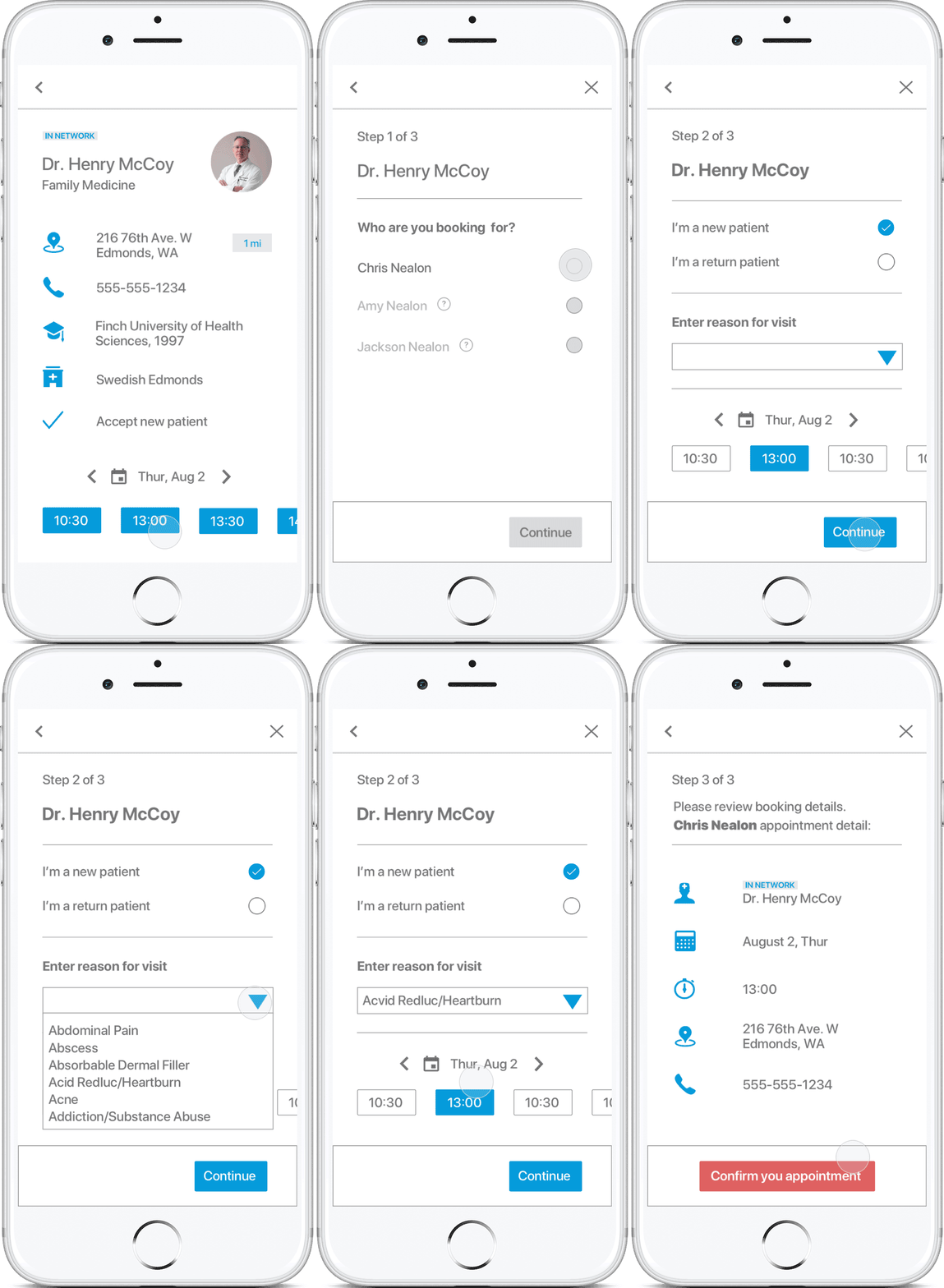
Using Modality to create focus by preventing users from doing other things until they finish the booking process. It is easy to exit the modality and go back to searching result by clicking on the top ‘X” button.
Put the “who are you booking for” as the first step to inform users as early as possible according to user research findings.
Confirmation
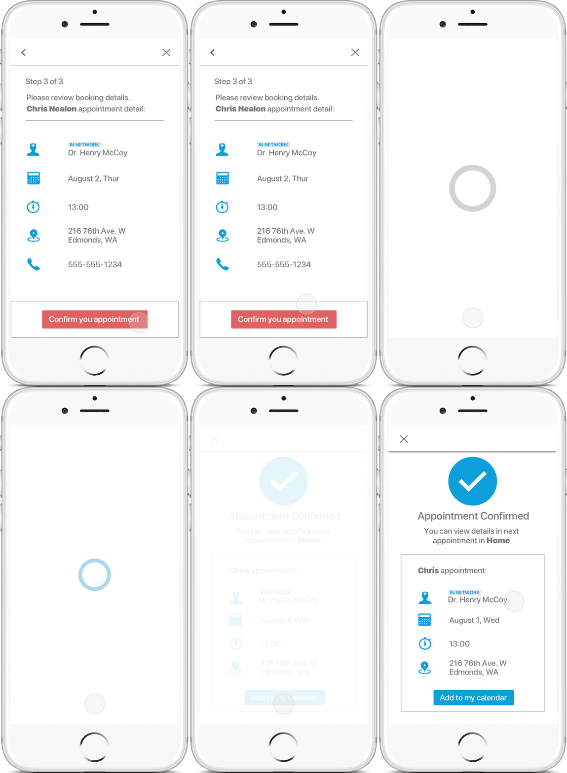
To accommodate with the technical strains that sending email confirmation is not available, I designed an in-app receipt section built in “Home” tab. Using motion design to make the confirmation process more seamless.
Reflection
Lesson Learned
In this summer, I learned how to work in an agile development cycle and how to work with people in different roles in a team.
Do more research before starting to design, and consider all stakeholders involved in the product.
Loop in the providers’ experience as early as possible. Know what’s their process of receiving requesting appointment.
Earlier understanding of technical constraints. Communicate with dev team and know about the viability of the products. Understand the scope of the product.
Move Forward
Cooperate with Provider Experience department and know about the need of marketing this feature and what kind of data we could use (i.e. Reviews of doctors).
Consider how to balance users’ needs and business goal. If achieving business goal hurt users’ needs, rethink the process and figure out a roundable solution.


